

I lightly brushed the raised edges with DO picked raspberry to give definition to the design. I also used Nicki's technique of lightly adding Lunar Paste to the blossoms and panel edges. The color is Slippery When Wet and I also used it to color Poppystmps Double Stitch Scalloped Rectangle Frame. 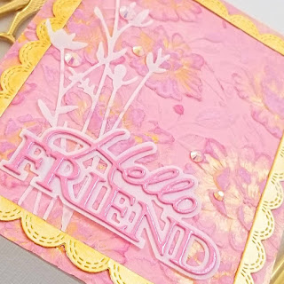

To get the size I wanted, I snipped off some of the MB Backyard Floral Stems which was die cut from vellum. MB Hello Friend Posh Script shadow was cut from vellum and the words from the pink cardstock blended with DOs like the panel. To make them stand out a bit more, the words were covered in Shimmer Pico Embellisher. Beautiful pink gems finish it off. I'm also entering SSS Wednesday via IG and Die Cut Divas.


 Thanks so much for taking time to stop by. If your blog address is in your profile or comment, I will visit you.

Next is my card for Pinkfresh Studios Flower Power challenge. Once again I pulled out PFS Sweet Friend Floral stamp/die/stencils. I love the whimsical style which makes lining up the stencils perfectly not required--at least to me!😉 

This time I used many CN9 ink cubes in pink, peach, blue and green shades for a pretty bouquet arranged in the center circle of a gray panel die cut with Slim Braided Circles Panel cut down to fit an A2 card. I added black splatters to the card front and shimmer to the flowers. You can see it in a short video in my IG post. 

The sentiment from Perfect Sentiments was stamped in Versafine Clair Morning Mist, clear embossed and popped up. I'm also entering SSS Monday and SSS Wednesday.
Did you see the Northern Lights? We looked from our deck at 10pm and couldn't see anything. But we heard that a cell phone camera can pick up color you don't see with the naked eye. So I snapped a picture and was amazed to see purple! I took another shot aimed to the south, just to be sure my camera didn't make the whole sky look purple. The sky was just black in that picture. Pretty amazing! We went back out at 11pm and could actually see some purple and again, the camera captured a lot of color. Not the fabulous view some people had, but still a pretty neat experience. Hoping for even better tonight.
Just love the gold & pink combo with all the texture on card one, Greta! Pretty bouquet on card two with the open circles!!
ReplyDeleteGreta, your first card is a stunner in pink and gold with the lovely texture. YOur second card is a fun design as well.
ReplyDeleteYour first card is so lovely and elegant Greta! Love the way you've framed your design. The second card is so charming. Every time you use that PF set you remind me I need to ink mine up!
ReplyDeleteLovely cards. I really like the pinks of the first card. So glad you joined us at DIe Cut Divas.
ReplyDeleteAs always pretty card but the first just stunning, would never have thought of pairing gold\yellow with pink but it works so well.
ReplyDeleteB x
Gorgeous cards Greta. So pretty. I didn't see the aurora as we live in a bit of a valley but saw some gorgeous photos from our near by beach. It is so amazing that so many place around the world, especially areas that don't usually get to see the lights.
ReplyDeleteTwo really pretty cards. Love the embossing on the first and those wonderful splatters on the second xx
ReplyDeleteYour pink card is so beautiful with so much detail added to it. I also love those delicate flowers on the second card with the soft coloring. So cool you were able to get a bit of the lights. I tried but didn't see a thing. There were sightings here in our state and lots of pictures posted. I'm amazed at how different they all are, but stunning.
ReplyDeleteSo much detail on the pink card! Love the accent shimmer! Thanks for joining us at Die Cut Divas!
ReplyDeleteI think that gold worked out perfectly! Thanks for playing along our May challenge at Die Cut Divas.
ReplyDeleteBeautiful set of cards, Greta! Love the touches of the gold embossing paste on the first one. It adds a pretty depth to the design. The second card is just so sweet with the cluster of flowers in the center circle!
ReplyDeleteYes! So pretty in pink, Greta! Wonderful embossed background and lovely sentiment die!
ReplyDeleteOops! I wanted to comment on your second card, too. It's very pretty with the flower image and braided circle panel! We didn't see the Northern Lights here for we looked for them too early. But, I certainly enjoyed looking at other people's photos of them, so beautiful!
ReplyDelete