


I used Soft Stone for the card front as I really love the look of white with soft gray. I used scraps of Lovely Lady & Green Parakeet cardstock for die cutting the blooms & leaves from Into the Blooms II. I brushed the ends of the blooms with Raspberry Fizz & the leaves with New Leaf ink. The flower tips are covered with Pink Glam Stickles & the white dots are Pico Embellisher.  This time I used Versafine Clair Morning Mist to stamp the sentiment from Essential Sentiments. I have to say, this simpler, brighter, fresher look is my favorite.

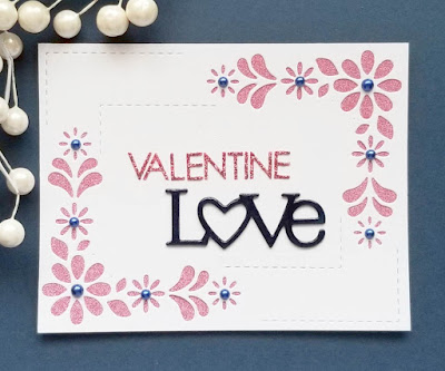
I used a scrap of PTI Dark Indigo to cut the word 3 times. The top layer was covered in Shimmer Pico Embellisher which adds shine & makes the cardstock look darker. Trust me, it really is navy--the same as the sheet under my card. Most of what I had left of a piece of pink glitter paper was attached behind the flower frame. It's a beautiful shade of pink, but is very difficult to die cut. This was a great way to make use of it. I dug through all my alpha stickers & found a sheet of white glitter ones that were the right size. 
I colored them with a dark pink Copic & then covered them in Pink Stickles--almost matches the glitter paper. Decided to keep it pretty simple, so just added some old navy pearls from my stash. I'm also entering The Snippets Playground.


The original card is so pretty, but I love the pretty spring colors on the remake. The Valentine is so pretty done in the pink and navy.
ReplyDeleteThat PTI LOVE die sat on my desk the whole time I was making valentines. It never made it on a card, but clearly it should have! Love the design, and would love to see all the sparkle from the glitter paper and Stickles in real life! Thanks for joining us at Color Hues!
ReplyDeleteLove all the cards you’ve made for this post Greta.
ReplyDeleteAbsolutely adore the Valentines Day card you entered into the Snippets Playground. Had to close the Treehouse due to Storm Eunice yesterday, but it should be safe to return today!! I’ll make you a nice hot chocolate with extra marshmallows. Xxx
Such contrast of colours on your three pretty cards Greta.
ReplyDeleteB x
They are absolutely gorgeous, Greta. Sending you a hug, my friend.
ReplyDeleteBeautiful cards Greta - all of them. I do so love your snippets card - really great that you managed to match the alpha stickers to the pink paper so well! Great use of snippets.
ReplyDeleteHugs
Di xx
I do love the soft pastel look of the flowers and the background is awesome. A sweet Valentine in the navy and pink. That is a beautiful flower border.
ReplyDeleteWhat stunners Greta. Love the new take on the first card - the soft background and flower are delightful. Love the second one. Great that you managed to make the small stickers match the glitter background. Perfect!
ReplyDeleteAmazing how different a card can look with just a change of colors. Fabulous. Your Valentine is sweet as well in navy and pink.
ReplyDeleteWhen I saw the first card I though how beauitful, then you said to "improve" on it? Well! I think maybe you have, only because it's brighter, a beautiful design and a beauitful card (both). Your Valentine card is so very pretty.
ReplyDeleteFaith x
The deeper hues of the original card still look lovely. However your makeover is a fresher spring like card, so pretty to welcome the spring flowers into life. I'm a big fan of navy and pink too, so I'm in awe of your gorgeous valentines card. Lovely work.
ReplyDeleteI like both of the first two cards Greta and yes the second one is fresh and already for Spring. Your Valentines card is delicate, so very pretty and I love to see it in the Navy and Pink. What a lovely change for Valentine's Greta x. Great how you did the Love die cut sentiment too x.
ReplyDeleteFabulous update of your previous card, Greta - love the light springy feel! And great Valentine Love card too!
ReplyDeleteWhat a gorgeous collection of fabulous CAS cards xx
ReplyDeleteThey're all so pretty, Greta! My favorite is the sweet pink bloom!
ReplyDeleteBeautiful cards, those flowers are so lovely and I specially like the effect on the word "Love".
ReplyDeleteBeautiful cards, Greta! I love the one for Color Hues! Thanks so much for joining us!
ReplyDeleteBeautiful cards! Thank you so much for playing along with us over at the Color Hues Challenge!
ReplyDelete